TYPE POSTER
Overview
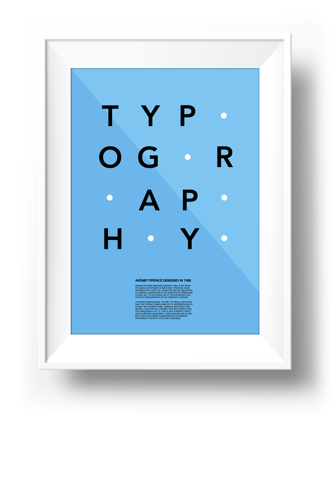
Adrian Frutiger designed Avenir in 1988, after years of having an interest in sans serif typefaces. In an interview with Linotype, he said he felt an obligation to design a linear sans in the tradition of Erbar and Futura, but to also make use of the experience and stylistic developments of the twentieth century.
The word Avenir means “future” in French and hints that the typeface owes some of its interpretation to Futura. But unlike Futura , Avenir is not purely geometric; it has vertical strokes that are thicker than the horizontals, an “o” that is not a perfect circle, and shortened ascenders. These nuances aid in legibility and give Avenir a harmonious and sensible appearance for both texts and headlines.
About Avenir
- Name of Typeface: Avenir
- Type of font: San Serief
- Designer: Adrian Frutiger
- Created year: 1988
-
Category
Print
-
Target Platform
Print
-
Role
Type poster design
-
Class
Typography
-
Year
2012
-
Language
English
TYPE POSTER
Avenir Typeface