


Strong robust framework across product, devices, and input methods.

A versatile tool with various features and functionalities which, facilitate users needs.

Well-organized, productive and effective, practical and smart.

Uncluttered and minimal design with a great attention to details.
Powerful, Actionable, Multifaceted
Intuitive, Efficient, Human
Clean, Modern, Elegant
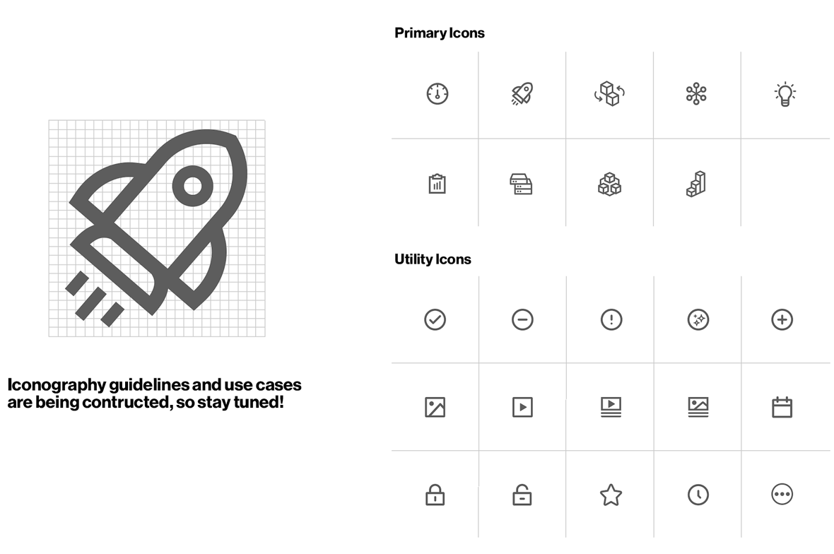
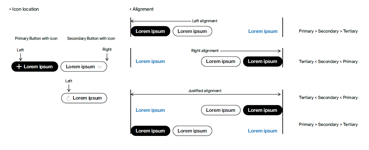
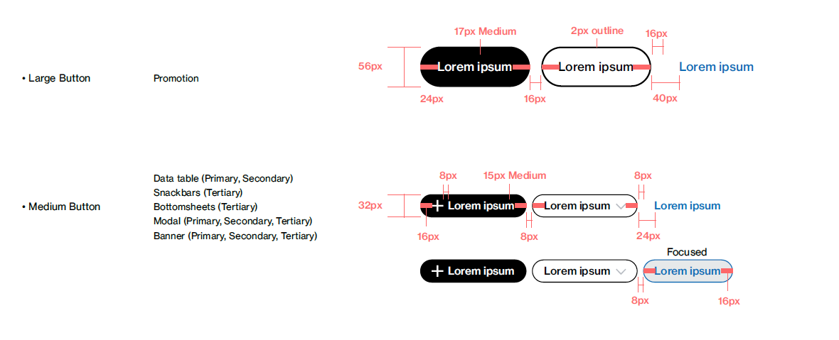
Button triggers a single action in a task flow. There are three types of button styles: primary, secondary and tertiary button. Use these in different combinations to guide users to continue and complete tasks.
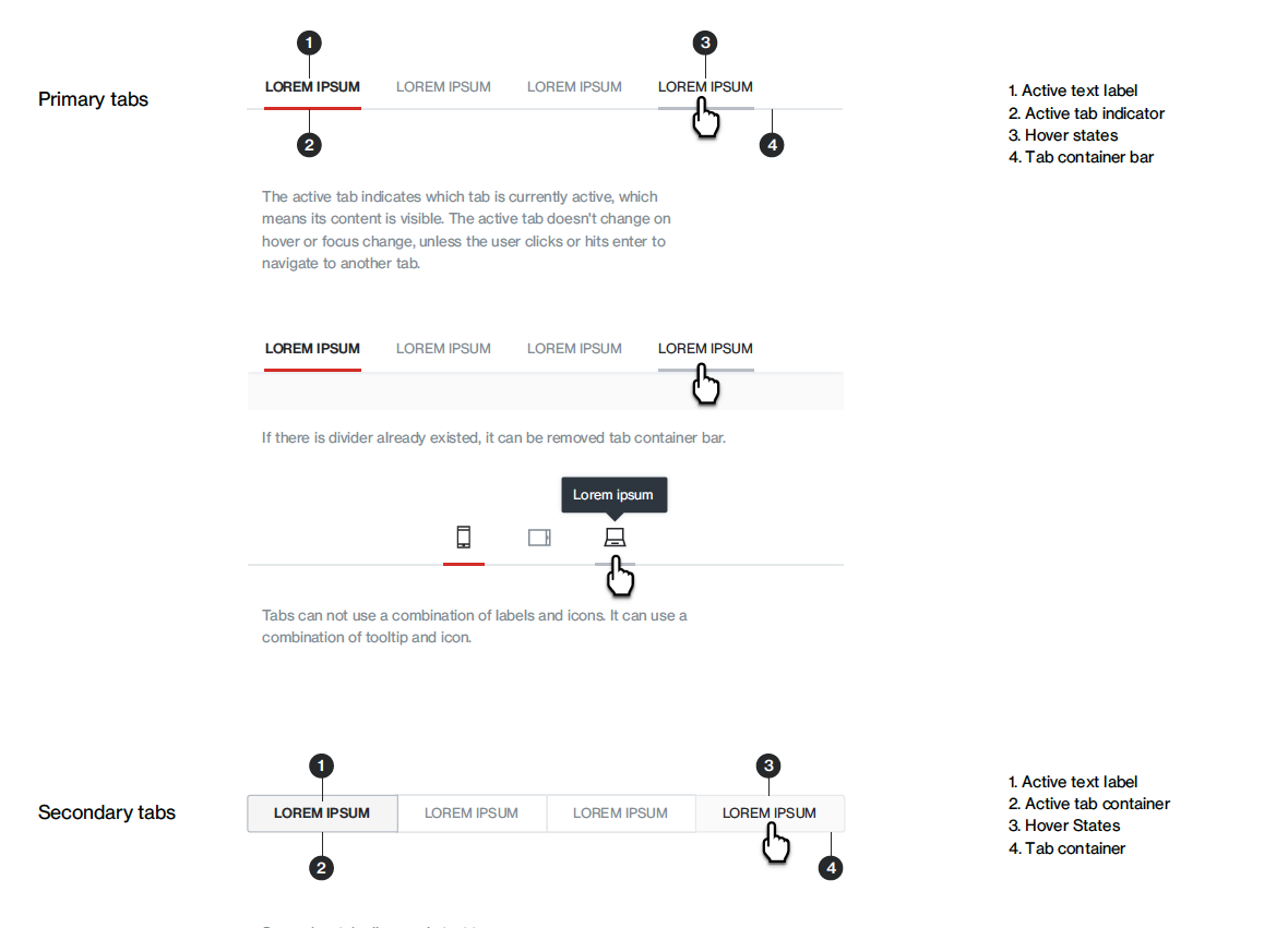
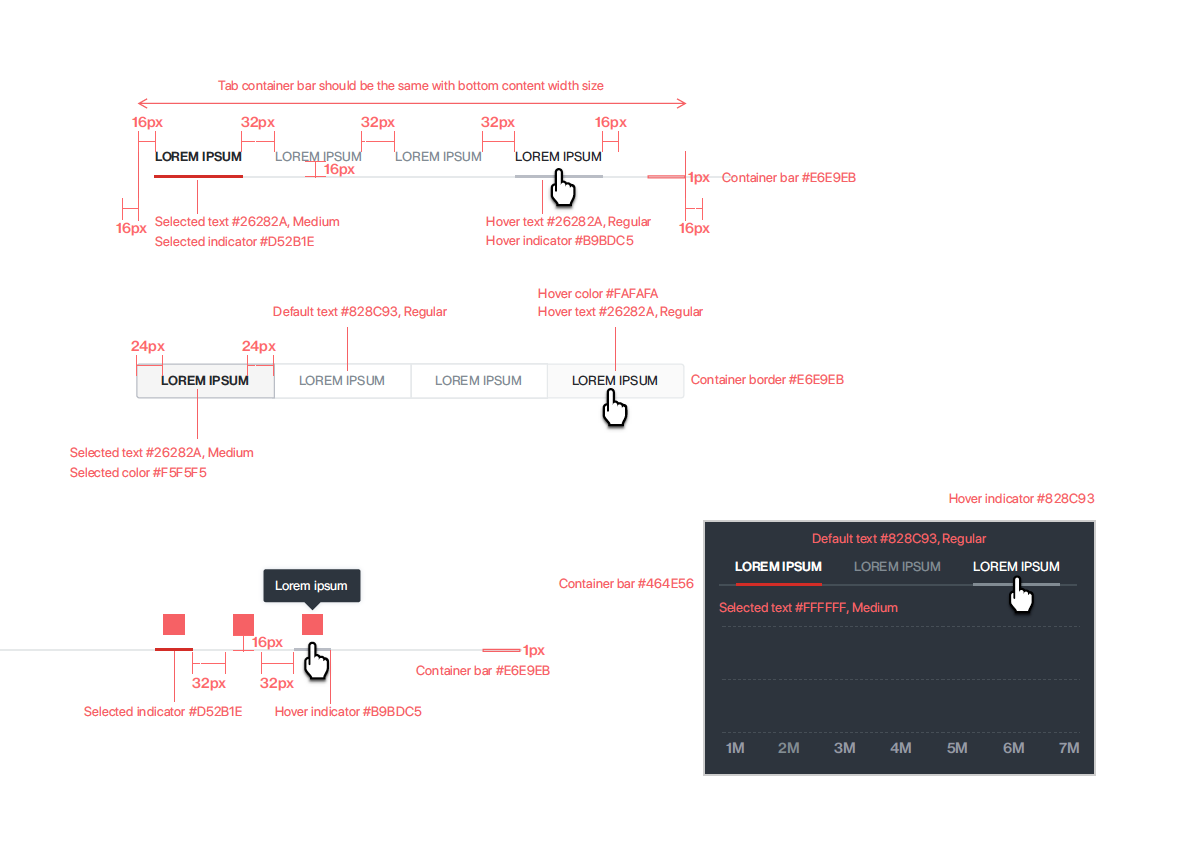
Tabs are an easy way to organize content by grouping similar information on the same page. This allows content to be viewed without having to navigate away from that page.
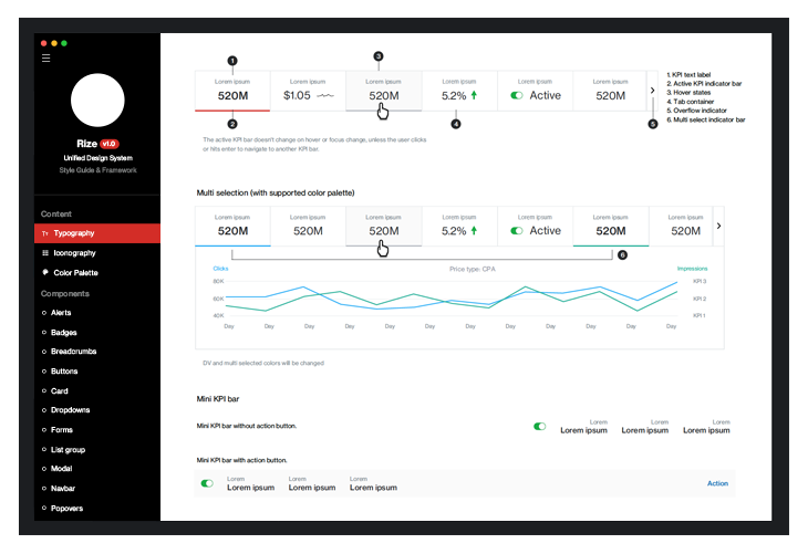
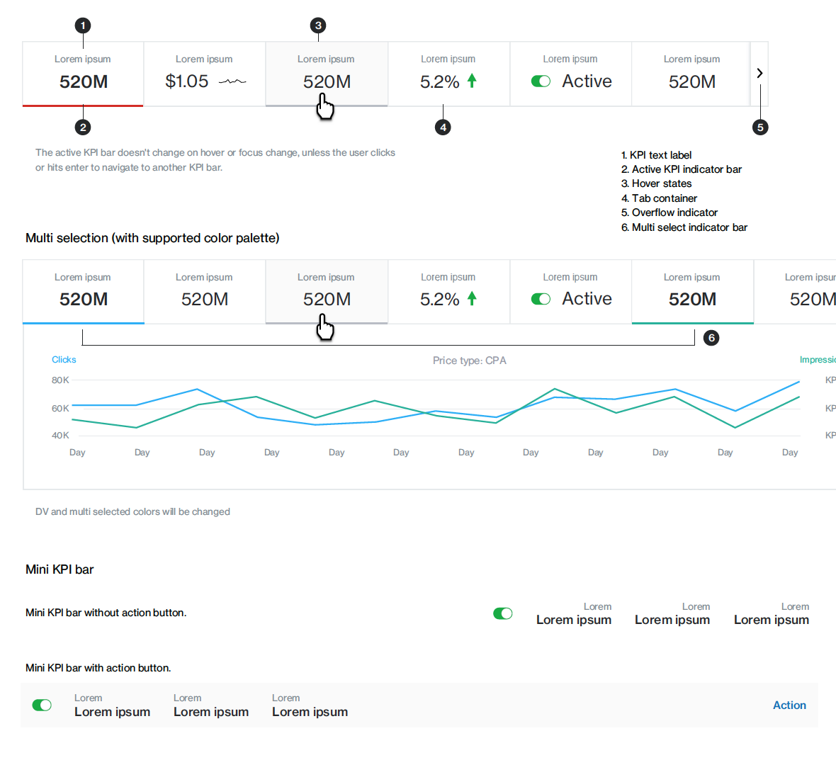
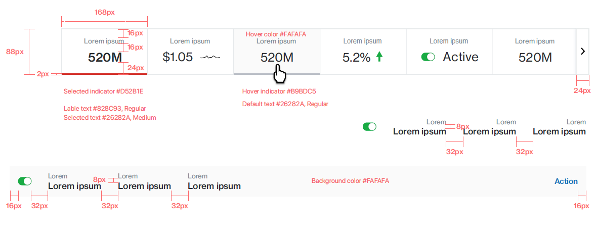
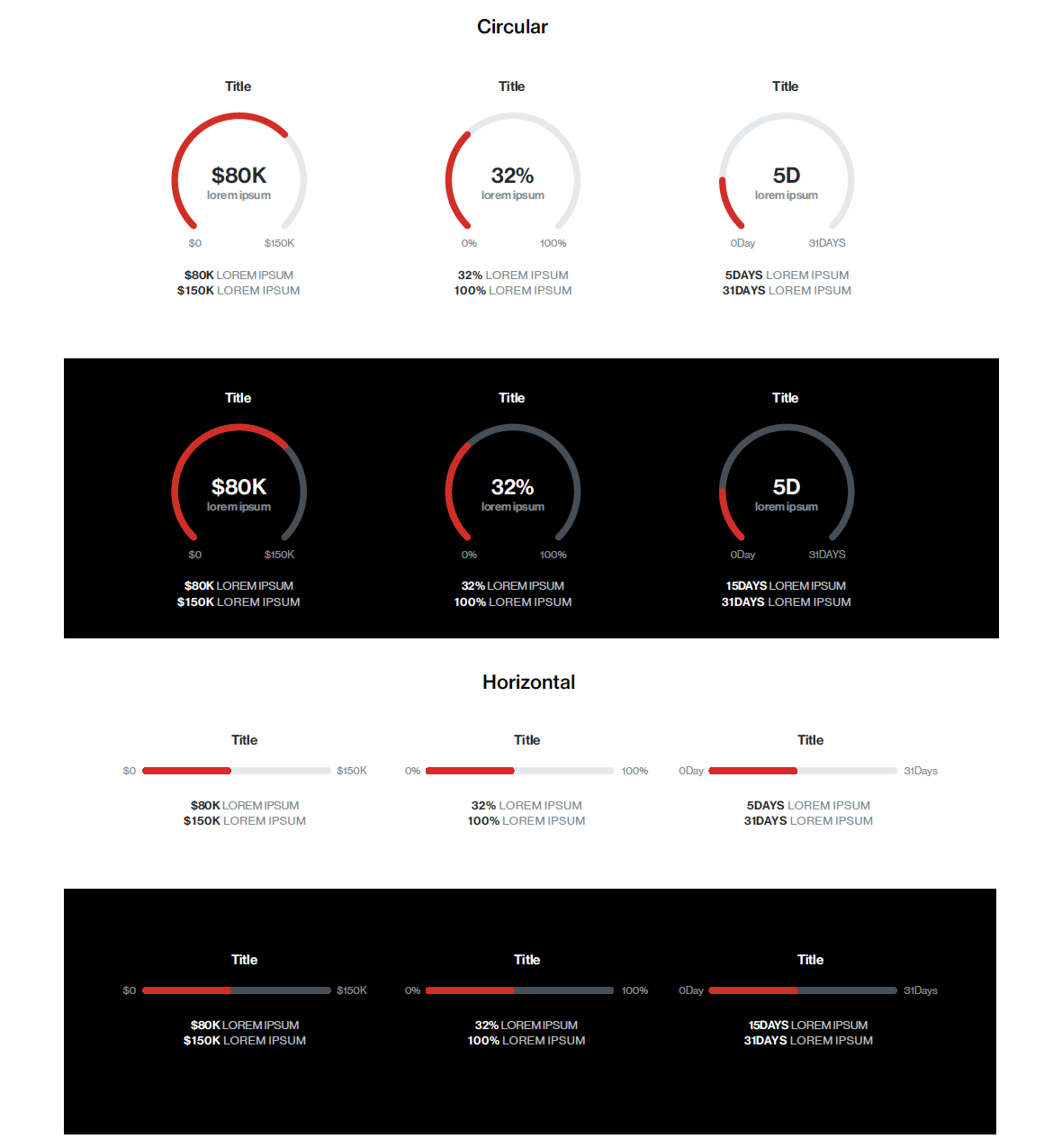
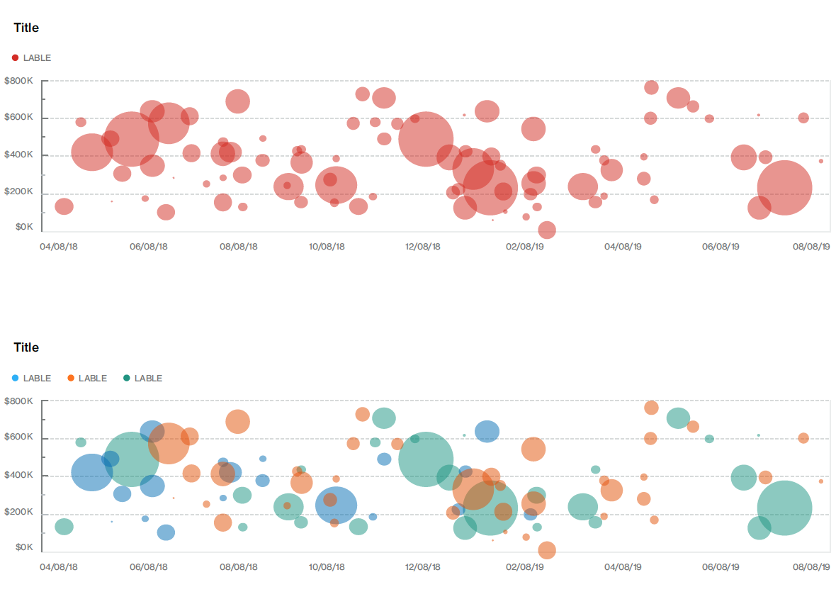
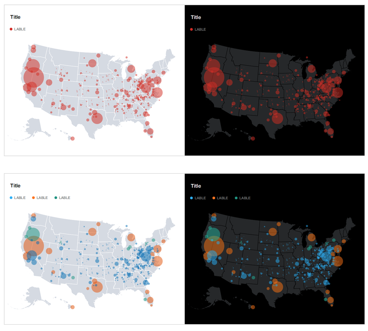
A key performance indicator (KPI) can be displayed as a single value, non-interactive chart. These charts are typically used as supplemental info in a case.
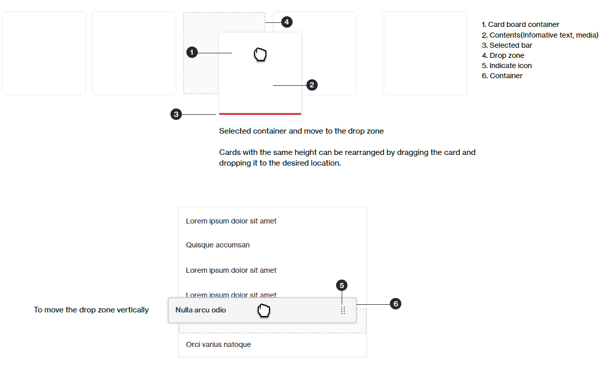
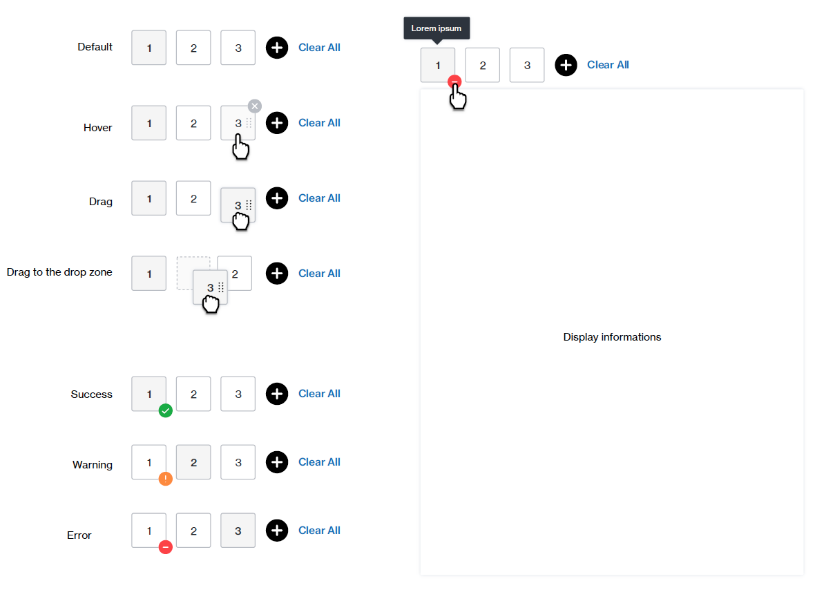
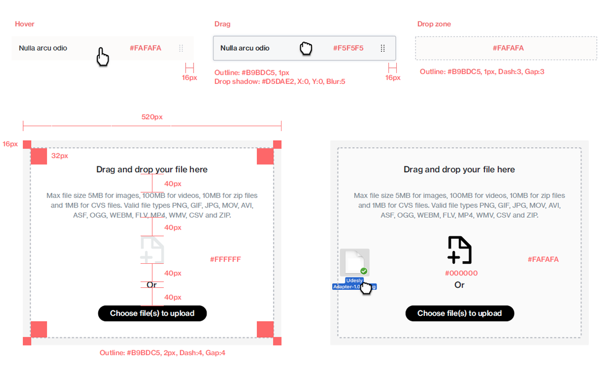
Drag and drop involves moving selected content from a source location to a destination. Drop Zones visually indicate to users where they may drag and drop components onto a page.
Gauges depict a percent difference between two timeframes for a single dimension using a single KPI, or the status of a single data point between the delivered values of the expected value.
Our brand palette has three primary colors, red, black and white,
which are used in the majority of Verizon Media communications.
Secondary colors serve as accent colors to highlight key information in communications. Our grays are used in very limited ways in print and digital.